01

Whitelines redesign
UX design · Group project · Figma prototype
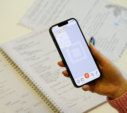
Whitelines lets people scan handwritten notes and organise, edit and share them digitally. Its useful functions could be difficult to find and use, so our group redesigned several of the app’s central flows.
We studied the existing interface, tested common tasks with users and built a detailed prototype in Figma. Our aim was to make it easier to find documents, understand where they are stored and perform editing tasks with fewer unnecessary steps. The scanning function itself was outside the scope of our redesign.

01
02

Testing the original app
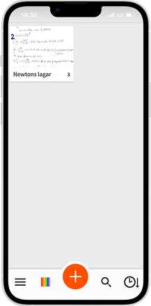
We began with a cognitive walkthrough and an analysis of possible user errors. We then observed first-time and experienced users completing ten tasks in the original app. The tests revealed several recurring difficulties: icons whose meaning was unclear, important actions hidden behind gestures and menus that did not always match what users expected to happen.
These findings helped us decide which flows to prioritise. The goal was not simply to change how Whitelines looked, but to make common actions easier to discover and complete.
02
Ideation & process
03
The redesign developed from sketches and wireframes into an interactive Figma prototype. We made document and folder navigation more explicit, brought key actions into view and reorganised editing tools around the task the user was performing.
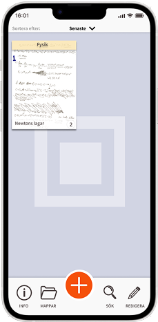
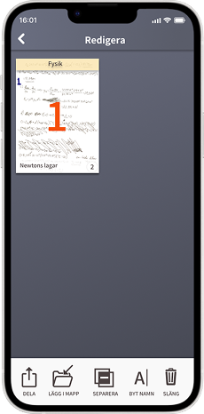
Several changes answered specific problems found in testing. The home screen showed documents and their folder context more clearly. Users could reach functions without having to guess that they should press and hold a document, and page order could be changed by dragging pages instead of repeatedly moving them up or down. We also made the menus more consistent while retaining a connection to Whitelines’ visual identity.
03
04
Final result
We evaluated the Figma prototype using the same ten tasks as in the original app. In the group’s comparison, the redesigned flows required fewer clicks and fewer erroneous actions. Participants also described the interface as easier to navigate and its icons and organisation as clearer.
The project portfolio reports a 33% reduction in clicks and an 86% reduction in erroneous actions for the measured comparison. These figures describe the tested tasks and prototype; they are not results from a released update to Whitelines. The complete screen comparisons and evaluation are available in the PDF below.
04
05
Key outcomes and learnings
Building the prototype taught me how visible actions, consistent interactions and shorter paths through an interface can help people complete tasks with fewer mistakes. Evaluating the tests showed me the value of checking what users actually do, alongside what they say about a design. I also learned to divide responsibilities more clearly within a group: by focusing on components and interactions while a teammate led the visual direction, I could contribute where my work moved the prototype forward.
Download the full Whitelines project portfolio (PDF)
View the Figma prototype